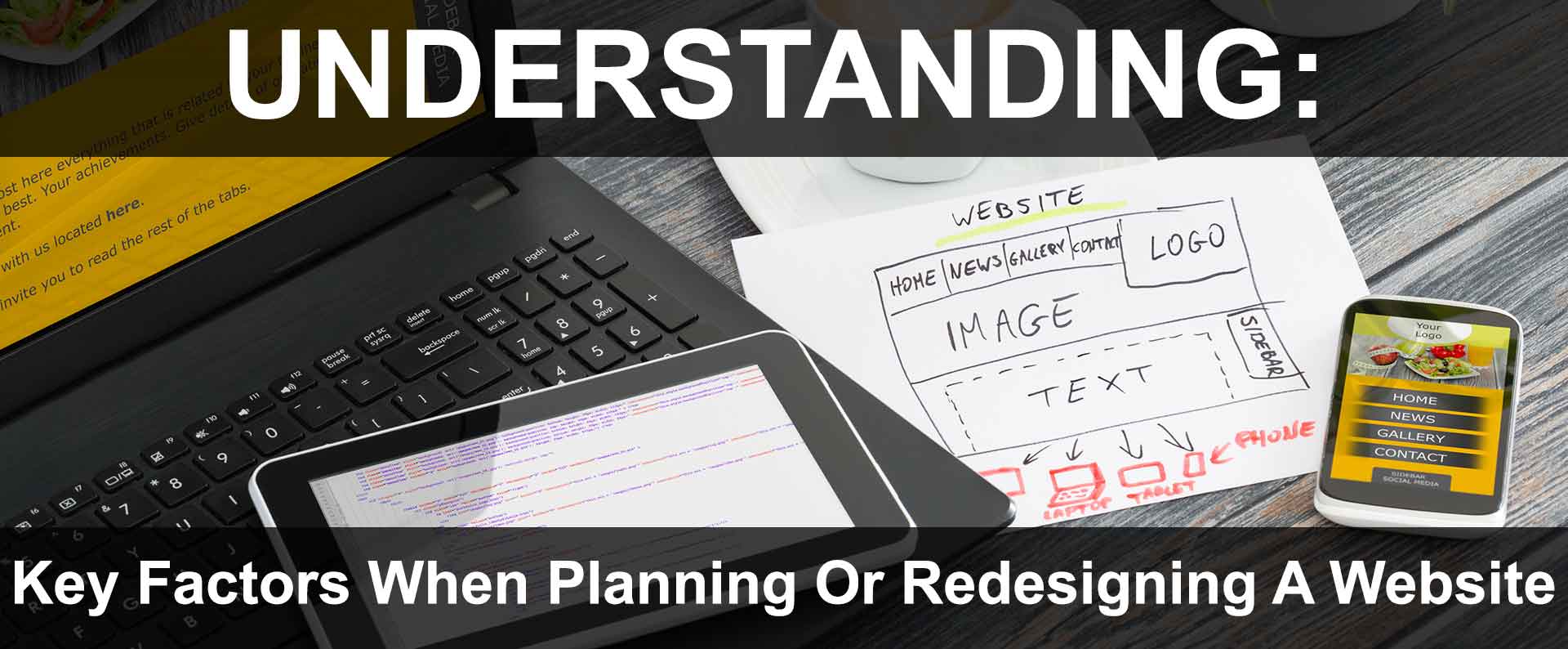
When creating a new website, or redesigning an existing site or application (webapp); a unique set of tactics apply (unlike traditional offline print medias like newspapers, books, or magazines).
There are many factors to take into account to make any site or webapp as effective as possible.
For this reason it is important to note some universal tips that should be considered when planning for a new website, or re-designing an existing one.
General Design Tips
- Make sure the design & layout is mobile-friendly; appearing consistent and accurately on all devices for improved user experience and consumer confidence (whether a smartphone, tablet, desktop).
- Create one responsive site:
- avoids requiring users to visit different site, or use different navigation depending upon the device used,
- allows for ease of maintenance with one site to manage, versus multiple sites.
- Forget page counters as they look messy and amateur.
- The site's hosting account statistics and Google Analytics will provide more insight on traffic and consumer behavior than a hit counter.
- Flashing, scrolling or blinking text is often distracting and looks amateur.
- If there is a need to draw attention, it can done with a professional graphic image or using bold or stylized text.
- Keep the look and feel consistent throughout all the web pages.
- This is key to a professional looking website.
- User consistent navigation.
- Visitors can become frustrated and leave sites with inconsistent menus and navigation.
- Use standard navigation.
- People are used to (and expect) top, right or left hand navigation menus.
- Non-standard navigation setups cause confusion resulting in visitor abandonment.
- Attempt to keep pages around 100kb in size.
- This keeps the site loading fast regardless of:
- browser (Safari, Firefox, Chrome, IE, etc),
- connection speed (high-speed cable, WiFi, cellular),
- or computer platform (e.g. smart phone, laptop, tablet, etc).
- This keeps the site loading fast regardless of:
- Avoid busy backgrounds.
- The goal is to focus the visitor's attention on the content ( business information, services, products, etc), not the background.
- Avoid using ALL CAPS as this can be distracting.
- As well, in the online world this is considered "yelling" at the reader.
- Avoid overuse of italics or bolding to draw attention on more than a few words at a time.
- Anything more is distracting, and the italic or bold looses it effectiveness.
- Keep the site color scheme simple.
- Too many bold colors, or too much design can be distracting or offensive.
- Make links obvious to navigate the site.
- If using images as buttons or links, make sure they look like they should be a link or button.
Website Function Tips
- Avoid using Flash when possible as it is not 100% cross platform compatible.
- As well, many users might have disabled Flash plug-ins, or not yet installed.
- Many of the same features found in Flash, and similar technologies, can be found by utilizing HTML5,
- HTML 5 is cross-browser compatible on all platforms including iPhone and iPads.
- As many may know, Flash does not work on iPhone, iPads, etc.
- Keep away from frame-sets.
- Frame-sets can often cause many issues with browsers and search engines.
- Overall, frame-sets are not friendly for search engines, or mobile-browsers.
- Keep away from using background music on a page.
- Music files often large and take time to download.
- Users dislike going to a site and suddenly startled by unexpected music playing.
- Avoid using pop-up windows.
- Lots of browsers have pop-ups disabled due to spam pop-ups.
- Often visitors find pop-ups annoying.
- Avoid automatically resizing visitors browser windows.
- Make the website fluid and respond automatically to the visitor's window size.
- Make sure the website has custom 404 error pages setup should someone encounter an error on the website.
- Make sure the site can be viewed in all browsers, including smart phones and tablet browsers including iPhone and Android phones.
- Avoid chat rooms and message boards unless the website has a very large base of visitors.
- Nothing looks worse than an empty chat room or bulletin board.
- Avoid javascript heavy websites.
- Javascript is okay to use sparingly as necessary.
- In general, javascript should be avoided as it is not always 100% cross browser compatible.
- Many people have javascript turned off.
- Some browsers on smartphones may not display javascript.
Search Engine Ranking & Optimization Tips
- Avoid using tricks (referred to as black-hat) to improve search engine ranking.
- Search engines are constantly learning to recognize black-hat tricks.
- Consequences may include:
- Lower ranking in search results,
- while some have been known to blacklist and ban sites for good!
- Using one responsive website (versus separate desktop & mobile versions) ensure:
- search engines, index all pertinent content,
- not just the mobile content as Google does.
- Natural search engine optimization provides the best long-term ranking in search results.
- If there is a need for immediate traffic, consider using Google Ads or SMM (social media marketing) such as Meta Ads (formerly Facebook Ads).
- For Local SEO, make sure the website is accurately listed in all major directories.
- Google's GMB (Google My Business) card is essential to Local SEO for "near me" and "around me" search results.
- Google also uses other major directories to help establish authority on NAP (name, address, phone) information.
- The more accurate the information across all directories, the higher the potential ranking in search results.
- Avoid redirecting visitors from one domain to another unless absolutely necessary.
- This is bad for search engine optimization if not done properly.
- Can cause confusion for visitors who do not understand why they were redirected.
- If a redirect must be done, a 301 Redirect is the best SEO method.
- Page titles should be short and concise, yet make sense to a reader.
- Preferably titles should utilize important keywords or phrases.
- Use semantic H tags (such as H1, H2, H3, etc).
- Avoid "under construction" or "coming soon" pages.
- Instead, put up a simple page that describes the service coming.
- Allow users to register for more information.
- A blank "under construction" page looks bad to visitors, and can hurt search engine ranking.
- Create a site-map that works as a general directory to all the website pages.
- If the website uses a dynamic CMS (like Wordpress),this can be accomplished with a plug-in or programming.
- Be sure to use the proper "ALT" and "TITLE" tags for images and links.
- These tags are important for search engines and optimization.
- They tell search engines what the image is, and what to expect on the other end of the link.
- Keep website links and navigation simple stylized text when possible for good search optimization.
- Avoid using images as links for best SEO if possible.


